Using Socioviz and Gephi to map the twitterverse
For quite some time I have wished that Twitter had a native visualization tool that let you see what was trending in real time. There are lists of course, but I’m a visual person and there is so much potential for information in a good network visualization. I already knew what it should look like, as I’d been making similar visualizations using the free graph visualiser program GePhi for a few years, and I knew I could do it myself but the hurdle for me was always getting hold of the data and processing it – I never had the time with the tools that were then available. Well, I recently discovered Socioviz which makes it really easy to get hold of recent twitter data, searchable and downloadable in a file that can be exported straight into GePhi. With socioviz I have finally been able to make twitter visualisations and here’s what i’ve done so far..
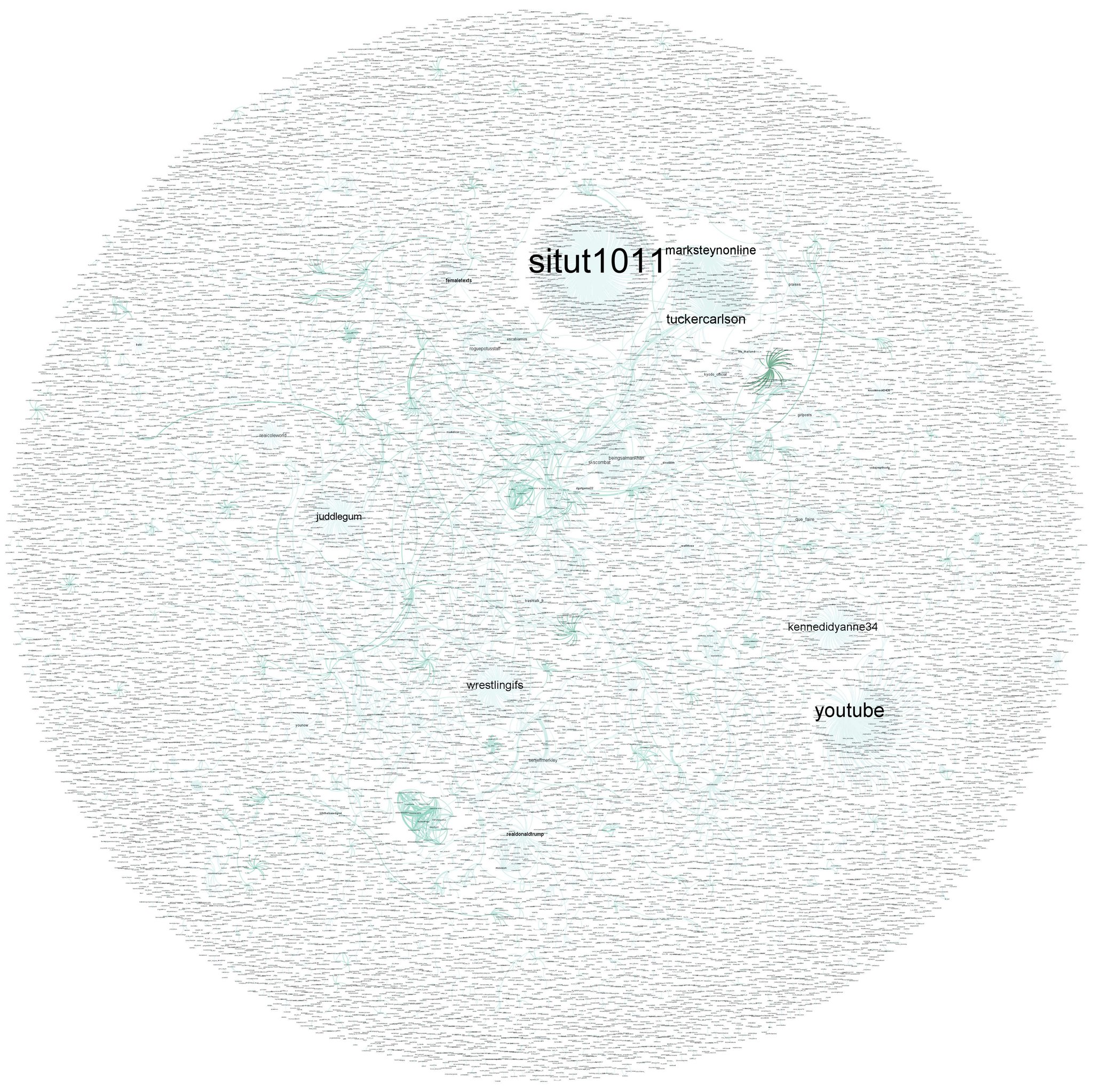
This is an example of what the whole of the activity on twitter looks like, over a couple of seconds, when charted as a network using GePhi.
Here is a close up:
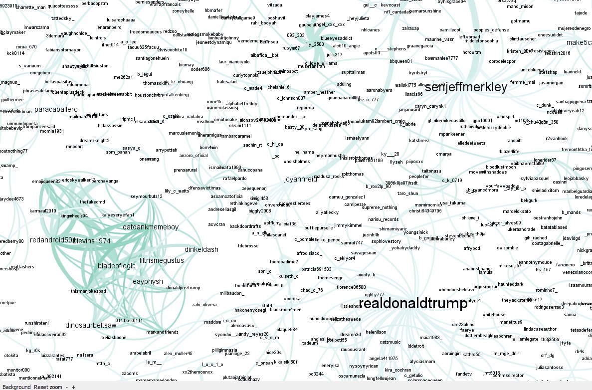
How to read this? All the names are people’s handles (with the @ removed from the front). A line is drawn between them when both handles feature in a single tweet (eg. in a reply or a retweet). If this happens more than once then the line gets thicker and this draws them closer together.
As a handle gets mentioned more and more then it’s dot (called a ‘node’) grows – or there is another way of displaying only those handles which are generating lots of tweets – more on that later.
In the images above you can see that ‘youtube‘ and’situt1011‘ were among the most popular handles on twitter in that instant when i got the data.* They were obviously being included in a lot of retweets. If you look at the close up, you can see realdonaldtrump is there of course, not necessarily tweeting himself, but being included in other’s tweets (those who fan out around him). There are also a couple of little knotty patches of twitter handles all tweeting each other. Either they are all part of a large reply (now that twitter lets you include dozens of names in replies) that is getting a lot of retweets, or they are all tweeting at each other – behaviour which looks a bit suspiciously bot-driven. The accounts in the knot shown here are not particularly worth visiting.
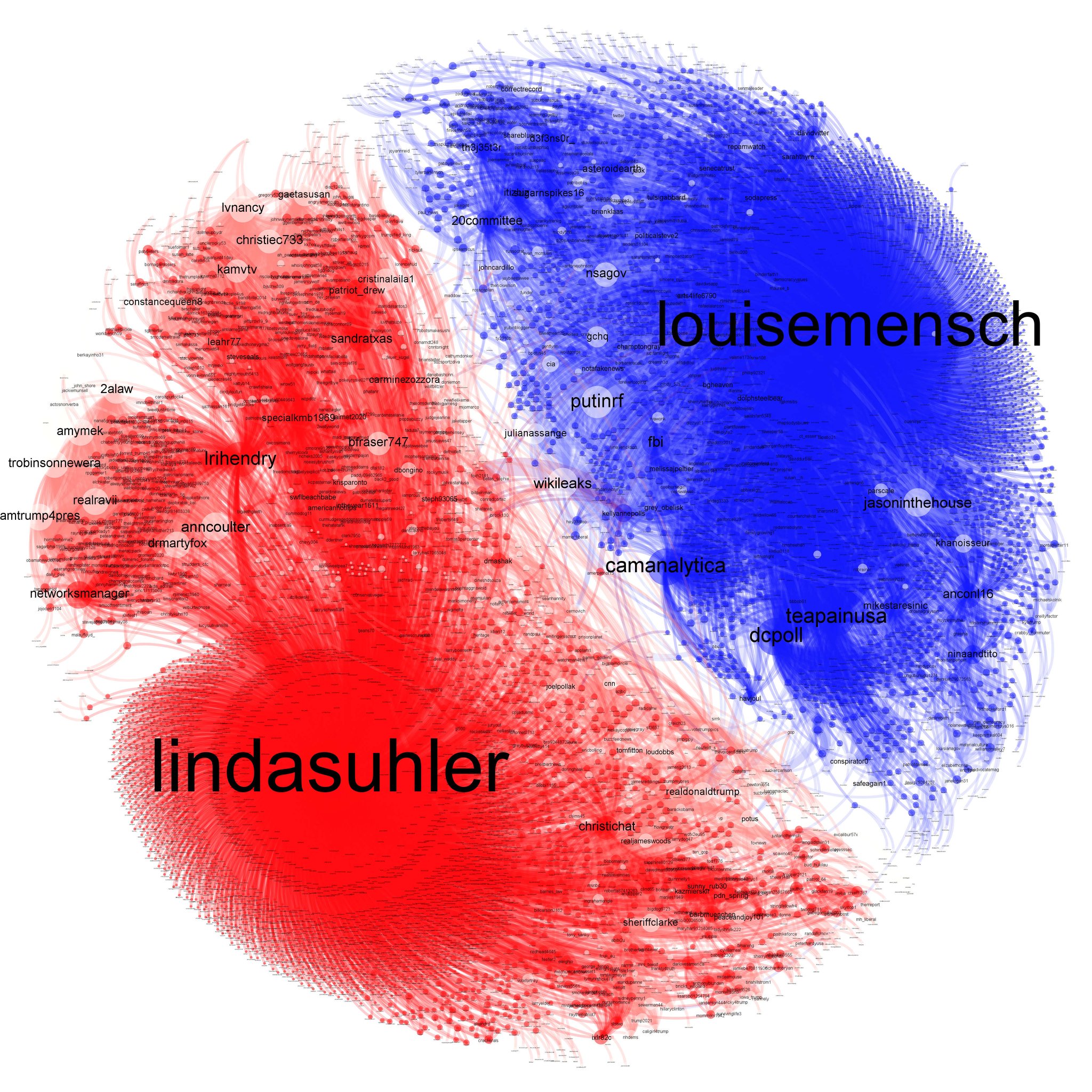
If you focus on a keyword, or a hashtag, or a handle, socioviz lets you grab up to 5000 tweets (with an account) which include the string you are looking for. I ran this query on the handles @lindasuhler and @lousisemensch – and amalgamated a few days worth of data in GePhi, to see which user groups these two heavy twitter users had. As anyone who follows US politics on twitter will know, these two users come from opposite ends of the political spectrum (@lindasuhler is also actually a suspected bot but that’s another story), but what really surprised me when I mapped both of their very large networks (based on a couple of day’s worth of data) is that there is virtually no crossover between them. It seems that apart from some connexions around wikileaks, followers of these two accounts are not interacting online at all. They could be interacting on other topics, which I didn’t check, but not in conversations that involve either @lindasuhler or @lousisemensch.
Because this tool is so fast now, I can do more or less real time analysis of emerging trends on twitter and plot the network to see what is really going on. I’ve done this recently on the #SyriaHoax hashtag which generated attention online as it seemed to come out of nowhere. There are lots of conspiracy theories about not only the ‘hoax’ itself, but also about who is starting these twitter storms – but simply looking at the data, it is easy to see who the main players are:
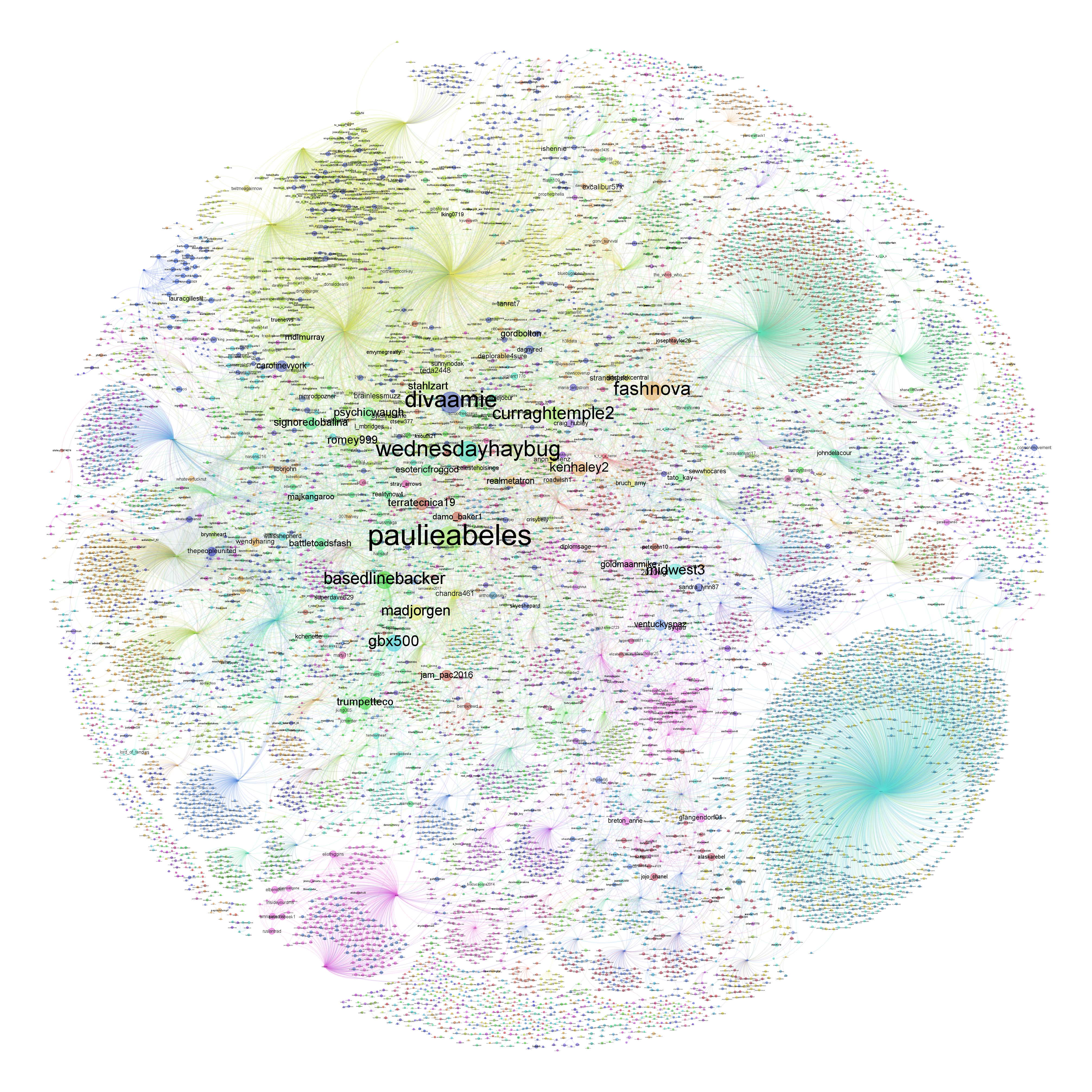
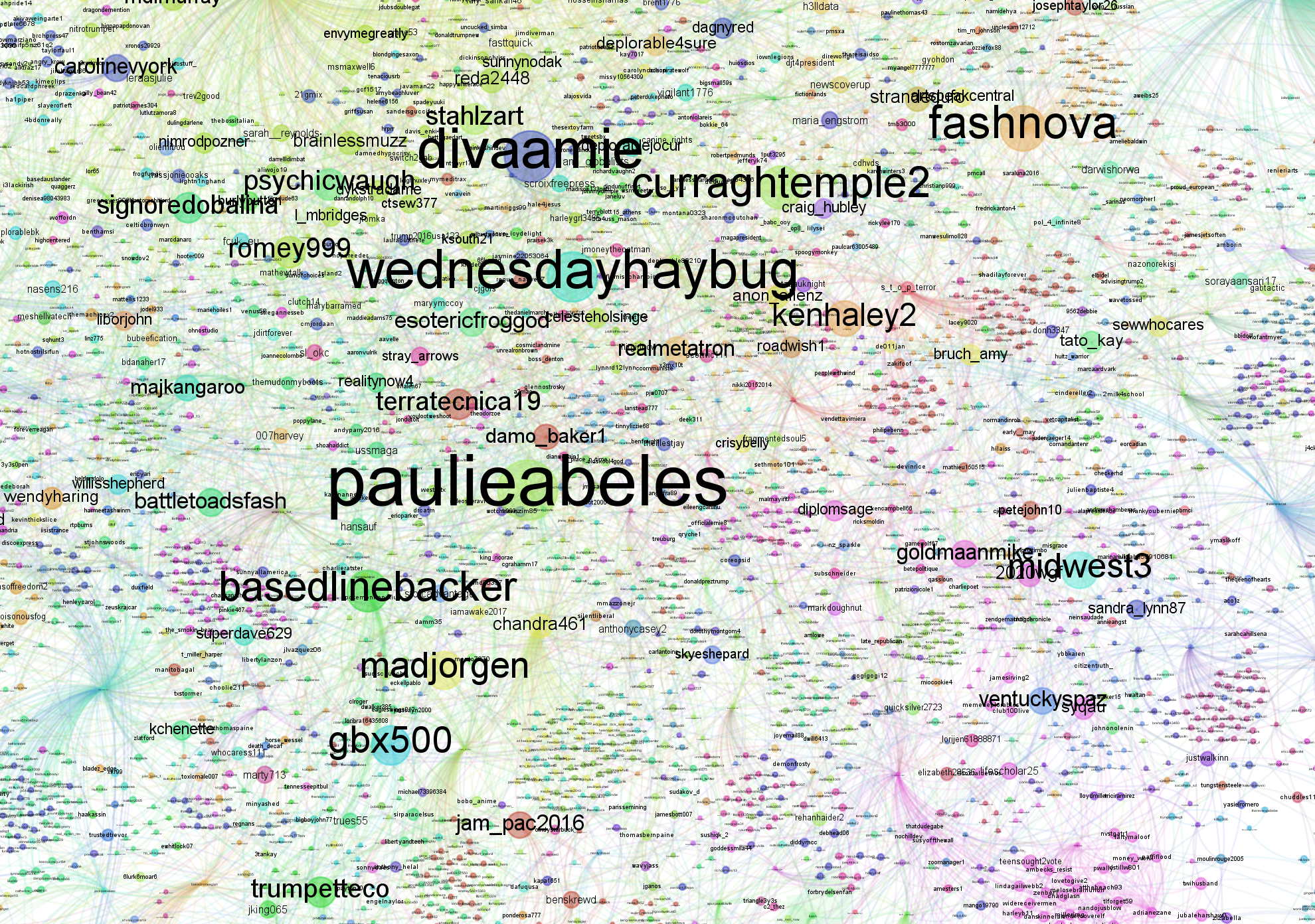
The first image shows a large chunk of twitter users who tweeted about #SyriaHoax in the days 6-8 April. The larger dots are the users who tweeted most often, led by paulieabeles. Some of these seem to have bot-like behaviour. Note that these users often don’t have many followers, and are often quitre new accounts. This contrasts with the other formations you can see – of a single popular user getting lots of single retweets from different users – which looks like a sort of dandelion seed head in these graphs (in this instance the largest of these in the bottom right corner is Caroline O).

By focusing on the most mentioned handles in a hashtag – in the example above I looked at #auspol activity for 4 April 2017 – what you see are the important topics of conversation, rather than busiest tweeters. It draws a different picture, and doesn’t draw out the heavy users, although it does still find out whatever their obsession of the moment is.
I hope this is interesting and if you’d like to see some more recent activity, have a look to see what I might have done on twitter today.
***
*a caveat: actually this wasn’t a complete snapshot, as it only included tweets that included certain english language characters like ‘a’. So it’s not a perfect representation of the whole. But I think it still gives the general idea)